Brand Centre
The AntraHQ logo and how to use it
Official logo files and the rules that keep AntraHQ recognisable everywhere — on apps, websites, invoices, WhatsApp, signage and partner listings.
The symbol
One HQ above every branch
The AntraHQ symbol is an A built in layers. The two feet are your branches, the crossbar tier is the platform that connects them, and the gold peak is the HQ — the one view an owner runs everything from.
It says nothing about scissors or salons on purpose: AntraHQ starts with salons and grows to clinics, studios and any multi-location business. Stacked layers also read as growth — every branch building toward the top.
AntraHQ — Salons & Beyond.
Logo files
Pick the right version
Use the primary logo with tagline wherever it fits. Every file is available as SVG (preferred, sharp at any size) and PNG.



Clear space
Give the logo room to breathe
Keep a clear zone around the logo equal to ¼ of the app-icon tile's width (X) on every side. No text, images or edges may enter it. The same rule applies to every version, including the symbol on its own.
 XX
Minimum size
Never smaller than this
- App icon / symbol16 px5 mm
- Primary logo96 px wide25 mm wide
- Primary logo with tagline140 px wide35 mm wide
- Stacked logo96 px wide25 mm wide
Below these sizes, switch to the logo without tagline, then to the app icon.

 Shown at actual minimum size
Colour
Brand colours
Always flat — never gradients on the logo. Antra Gold has two tones from the same hue: bright Antra Gold on dark and violet backgrounds, and deeper Gold on Light on white — so “HQ” and the tagline stay readable everywhere. Never put bright Antra Gold text on a light background. CMYK values are conversions — request a printed proof before large print runs.
- HEX
- #6D28D9
- RGB
- 109, 40, 217
- CMYK
- 50, 82, 0, 15
- Use
- Primary · tile, buttons, links
- HEX
- #E3B04B
- RGB
- 227, 176, 75
- CMYK
- 0, 22, 67, 11
- Use
- On dark & violet: HQ peak, "HQ", tagline
- HEX
- #2E1065
- RGB
- 46, 16, 101
- CMYK
- 54, 84, 0, 60
- Use
- Dark backgrounds
- HEX
- #92650C
- RGB
- 146, 101, 12
- CMYK
- 0, 31, 92, 43
- Use
- On white & light: "HQ", tagline, gold text
- HEX
- #0F172A
- RGB
- 15, 23, 42
- CMYK
- 64, 45, 0, 84
- Use
- Wordmark & body text
- HEX
- #FFFFFF
- RGB
- 255, 255, 255
- CMYK
- 0, 0, 0, 0
- Use
- Backgrounds & reversed logo
Typography
Plus Jakarta Sans
The wordmark is drawn from Plus Jakarta Sans ExtraBold and supplied as outlined artwork — never retype it. Use Plus Jakarta Sans for headings (Bold / ExtraBold) and body text (Regular / Medium). It is free under the SIL Open Font License from Google Fonts.
Backgrounds
Approved backgrounds
White — primary

Midnight — reversed

Antra Violet — white logo
Light grey — primary
Misuse
Please don't
Don't recolour the logo
Don't stretch or squash
Don't rotate or tilt
Don't add shadows, glows, 3D or gradients
Antra HQDon't retype the name in another font

Don't use the reversed (white) symbol on light backgrounds
Don't place it on busy patterns or photos without a solid panel
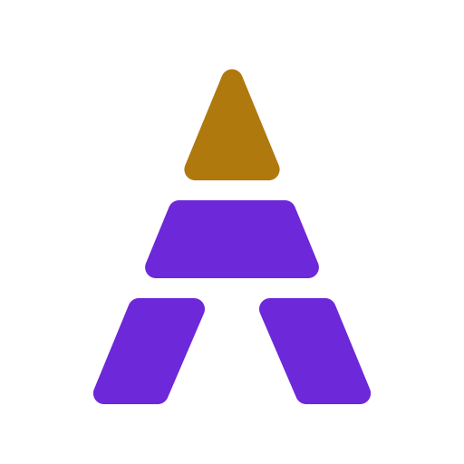
Don't recolour the HQ peak or rearrange the tiers
Also don't: separate the tagline and move it elsewhere, change the gap between symbol and wordmark, outline the logo, or use any earlier AntraHQ logo.
Using AntraHQ in your materials
AntraHQ is a brand of ANTRAHQ TECHNOLOGIES PRIVATE LIMITED. Partners, salons and media may use the logo to refer to AntraHQ without changing it. For co-branding, place the logos side by side at equal visual height, separated by a thin vertical line, with clear space around each. Questions or approvals: contact@antrahq.com.
Back to downloads